Renowned for his work with private residences, exhibition design, and university projects, Kent Chiang, an award-winning principal architect at Aidlin Darling Design and a Harvard alum, stands as a distinguished figure in the field. The accomplished architect also has an itch and an eye for interior design, exemplified by his firm being inducted into the Interior Design Hall of Fame.
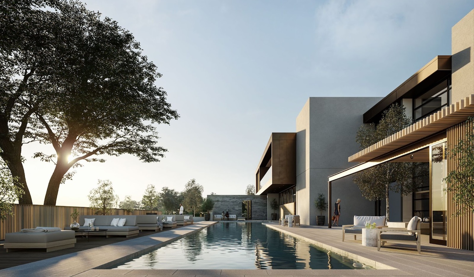
Kent prides himself on using his hands to design, using light as a tool, and an experiential process to create. In conversation, we learned more about his involvement and vision for The Island Club, Yerba Buena Island’s highly-anticipated community gathering space that provides residents with a place to relax, recharge, and connect with wellness, fitness, and entertainment experiences–a place Kent fondly described as “an extension of your home.” From an outdoor pool and hot tub to sauna rooms, lounge areas, and a library, The Island Club is set to become an essential part of daily life at Yerba Buena Island. In the following interview, Kent shares his early inspirations, what to expect from The Island Club, and what it means to create with intention.
Yerba Buena Island: Can you recount the moment that ignited your passion for architecture and design and how your personal experiences have shaped your approach to your profession?
Kent Chiang: I knew as a child that that’s what I wanted to do, but without knowing the name for it–I didn’t know what an architect was. I have memories where I would go to someone’s house, and I had this desire to rearrange their furniture, and I’d do so–I’ve been doing that all my life. I have this mental desire just to change everything. It’s something I do, and I cannot help it; it’s built into the way I want to see how space is created.
I’ve always had this image in my mind of a house that my grandfather built in Taiwan. I remember a courtyard where the light came in, and I always felt that was a space I wanted to be in. That’s an image I often return to in my life and work. The courtyard is near and dear to my heart, and I’ve done a few projects in that typology already. It all goes back to my grandfather.
You felt attracted to both interior design and architecture. What made you choose architecture?
KC: My firm does interior design as well, so I get to do both. It’s great I get to produce architecture and suggest furniture and fabrics–I’m getting the best of both worlds. I don’t draw a line between interior design and architecture or inside and outside. As an architect, I’m always thinking about interiors because it’s a continuous experience–it doesn’t stop when you walk in the door. When we design something, we’re conceiving the landscape at the same time, the building at the same time, and the interior at the same time. It’s very holistic.
Congratulations on the 2023 Merit Award for The Prow and the Interior Design Hall of Fame. What do those awards mean to you and ADD?
KC: It’s always nice to be acknowledged, so we really do appreciate that. It speaks to the fact that we have this way of doing interiors and architecture that feels right. I think that’s the key–it’s about what feels right.
You talked about your grandfather’s house, the light shining in the courtyard, and sensory-driven methods, and how that plays a role in modeling before physical modeling or sketching. How do you bring that to life before you bring it to life?
KC: The idea of using one’s hand to design is becoming more and more rare. Our office still embraces it–for many of us here, it was part of our process when we started our profession. When the two founding partners started this firm, that’s exactly what they were trying to design against. They see how the whole profession has gone digital. They’re using computer design, they’re using digital modeling–and I think computers are so efficient, but you could get kind of lazy with it. It’s quite easy to use this quick design process just to get it done. What we’re proposing is this alternative way of designing things slower, designing for the experience, and really thinking about what we do because it matters at the end of the day on the experiential level–it doesn’t matter how efficiently it was created.
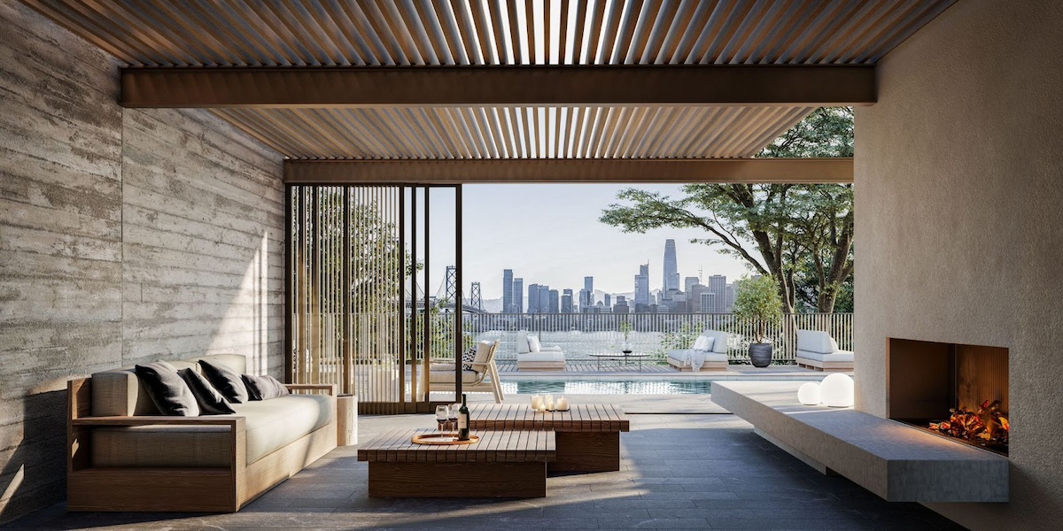
I would love for you to talk more about your first experiences with the island, how you first approached it, and what shaped your vision for The Island Club.
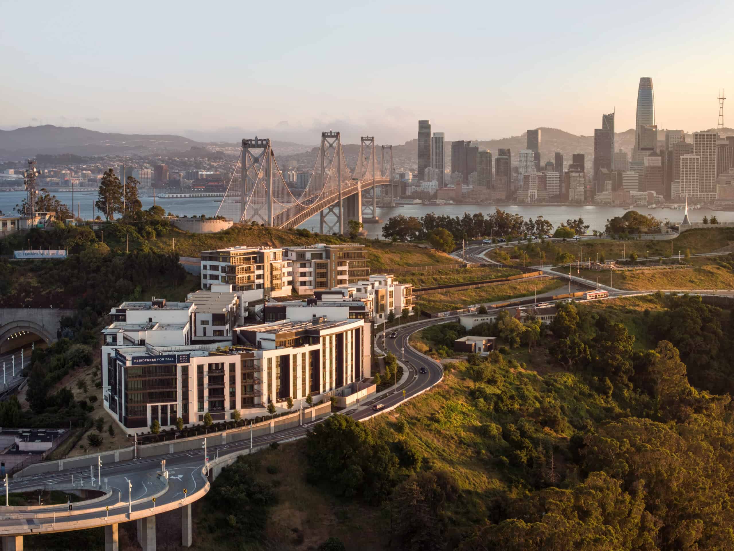
KC: Yeah, this was a once-in-a-lifetime opportunity. It’s an island in San Francisco–there’s just nothing like it, and we all feel a responsibility to do a good job with it. I went on a tour with other designers of the island, and Chris [Meany] was talking about his vision for the island. And what I took away from it was that the island is so beautiful and spectacularly well-preserved, and all of the buildings there look like they respect nature. So whatever we do, we want to continue that sensibility of respecting the island and nature, and whatever we build has a need to fit in and needs to be an extension of it. We wanted a space that still preserves nature, functions like a clubhouse, and offers amenities but is done in the most intuitive, non-invasive way and just feels like it belongs. And I think that’s our thesis for this project.
I’d love to hear from your perspective because you’ve worked on so many different projects, from personal residences to university projects–how do you feel Yerba Buena Island is unique, and what do you think sets it apart?
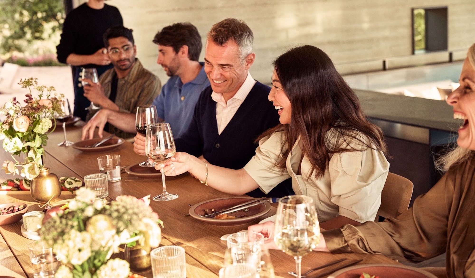
KC: The way we look at this is that all these people who are here have had experiences in very beautiful places around the world. They are well-traveled, educated, or cultured, and we wanted to figure out what additional layer we could add to their experience here. We don’t want them to go to a place like the clubhouse and feel like they just arrived at a clubhouse. We want The Island Club to function like a place of community gathering but also feel like a nice residential environment, which happens to do all these other things, too. The way we designed the entryway, the way we set up this circulation, and the way we organized spaces was so it could feel intimate, like it’s a place where you could relax. It’s an extension of your home. It’ll be a place you can get away to be alone, maybe some space away from your pets at home (laughs), and it can be a place you go to meet with friends.
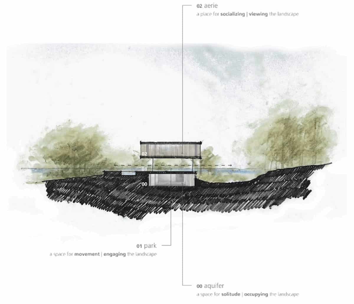
On Aidlin Darling’s site, there is a drawing that outlines “AERIE, PARK, and AQUIFER.” Can you speak more to the design philosophy behind these three components and how they fit into the narrative of The Island Club?
KC: The topography of the site drops, and because of that, it has a relationship to the sky, the skyline, the trees, and the park. All these elements exist on a datum. We want to take advantage of that topography, and if we design it as an extension of the landscape, we will have a building that fits. We see the ground as a social base–it’s connected to the sidewalk, street, and park where you walk. The spa is placed under because you are closer to the earth, you want to be surrounded, and there’s a level of comfort in that enclosure, which is why we put the spa program down there. And then when you go higher, you are above that, you’re elevated, you are closer to the sky and clouds, you’re looking over the trees rather than under, and that’s a different kind of experience. It carries this experience of being separated from your everyday life, psychologically speaking. So, we think about all these levels as a different type of psychological space. Every single level has its own particular ethos with its own unique experience that’s related to the topography.
How did the natural landscape of Yerba Buena Island influence your design of The Island Club?
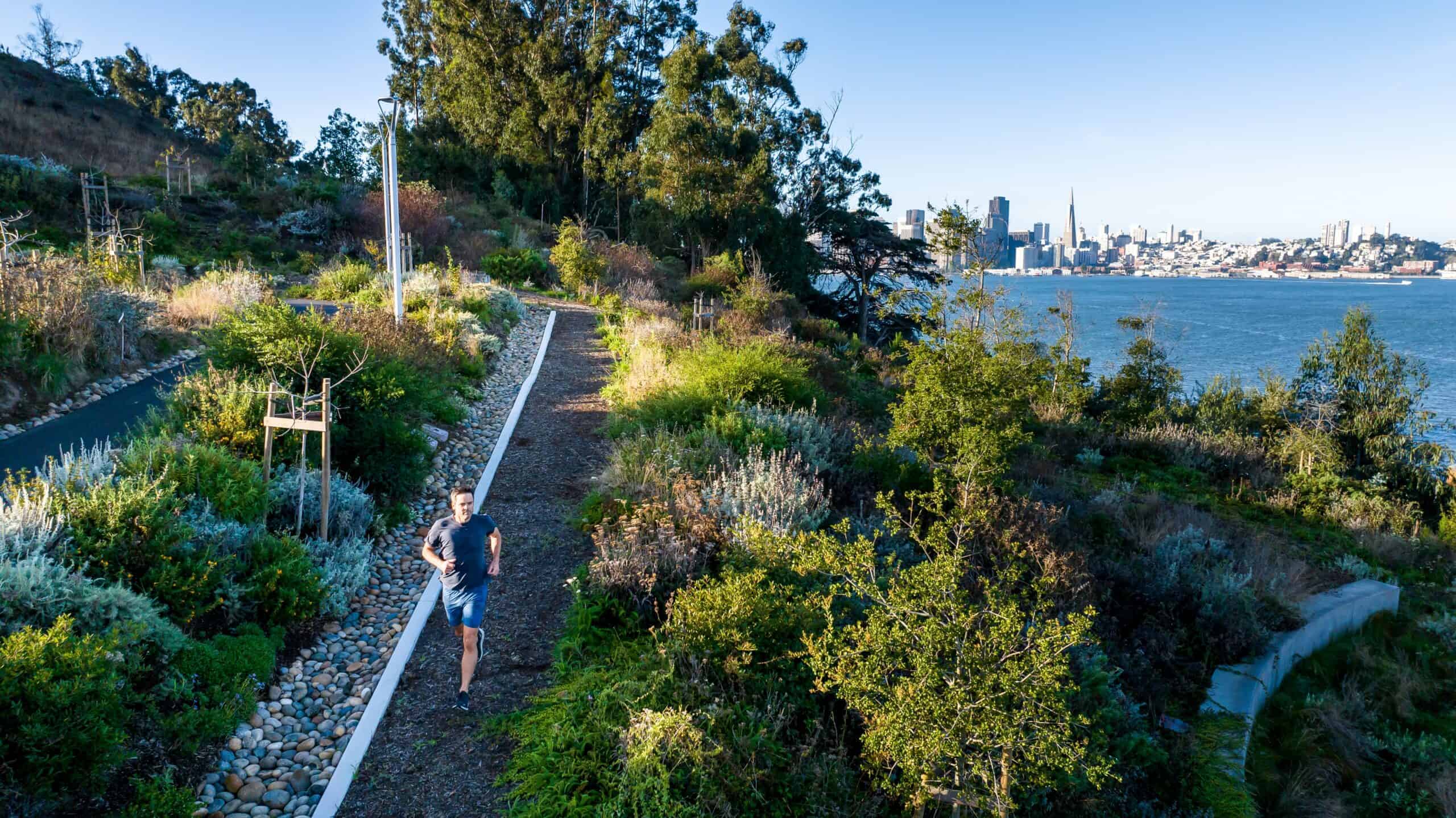
KC: We wanted to give each space a different experience by privileging certain areas to a certain view. You have this extra layer of connection to nature, and that’s something that we want to achieve. You have the natural side, and you have the city side, and we want to embrace both. There are certain spaces where you turn your head one way, you see the trees, and then turn the other way, you see the downtown view, and that’s perfect because it speaks to the whole situation of this island. It’s an island that’s really natural, but it’s very close to downtown, so it has a bit of both, and we want to embrace that in the way we situate the rooms in The Island Club.
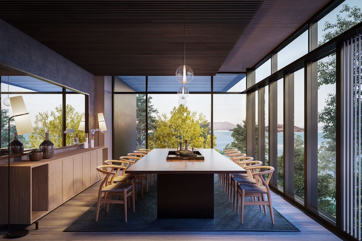
Is natural light a driving force when designing a room or space?
KC: The way we see the environment is entirely governed by light. It’s one of the most important things in everything we do. You can have the most beautiful plaster wall, which might be expensive, but with the wrong light, it means nothing. It’s really that important. Lighting is one of those elements we use as a tool in design. It’s something we take very seriously because it’s one of the most important pieces of the puzzle that we play.
In the case of The Island Club, it will be occupied all the time. Because any number of people can use any part of the space at any time, the light will create a natural world rhythm where people want to occupy a certain part of the space in the morning and other areas in the afternoon. I could see someone having their morning coffee in the dining room or the library, and in the later afternoon, they’ll probably want to be out on the balcony and the bar area to have drinks and look at the sunset.
There’s a growing demand for features that enhance holistic well-being. How does The Island Club embody this philosophy, and what kind of experiences are you hoping residents will have within these amenities?
KC: The Island Club is not an entity all by itself–it works only because it’s connected to everything. It’s part of nature, it’s part of the trail system, it’s part of an entire repertoire of what people do throughout their day. The workout, the running, the swimming, the reading, the having coffee, the drinks, the lunch, the dinner. We try to make the circulation intuitive. We make the space feel good to be in. We just want The Island Club to be part of your life in any way possible–and we designed it to be that.
The seamless blending of indoor and outdoor areas at The Island Club is a great achievement. Can you share some design strategies that brought this vision to life?
KC: The gym has almost no view of downtown, and all the views are directed toward this kind of wall-to-wall, floor-to-ceiling glass looking at the park with this special filter screen, so you get to see out, but people don’t get to see in. That’s one example of how to achieve the connection between inside and outside–there’s a very strategic, specific way to set up that relationship. And it’s not about just opening everything up because that’s not necessarily good. The key is about creating a natural connection to the outside, not forcing a connection at all costs. Another aspect of how we place these programs very intentionally is how we placed the more intimate side of the dining room toward the trees outside and the more open side towards downtown.
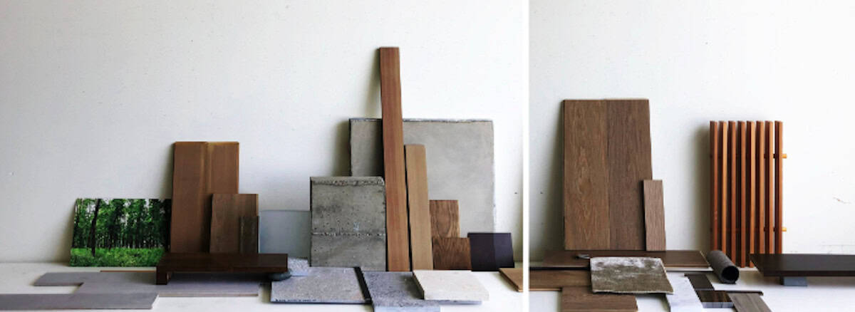
Could you explain how your design choices for The Island Club, particularly in terms of materials and design concepts, align with the island’s overarching goals and values?
KC: We wanted The Island Club to feel quiet. So, we don’t have intense colors–the palettes are very neutral, with very earthy surfaces to feature the art that we will have. We’re going to have a very well-curated collection of photography and artwork that features local artists. And so, the best way to feature art is to neutralize your palette. The building also takes on life from the light itself. If you think about color and materials, the quality of the material already comes from you touching it. For this project, we just want to neutralize everything and let the light do its magic and for the art and furniture and the rugs to become the stars.
It sounds like all the materials were intentionally chosen to be slightly more subdued so people can create their own stories.
KC: It’s what we need as a society right now, having a quiet place is the right solution for this time that we’re in. I also feel like we have amazing nature. We have a beautiful view of the downtown, we get the water, we get the sky, and we don’t need a building to get in the way. Our intention has always been about creating a building that fits and belongs and will look good in 20, 30, 40 years.
What is the primary philosophy that has guided your approach to architecture, and how do you prioritize the emotional experience of a space alongside its visual aesthetics?
KC: The power of architecture already comes from experiencing it and feeling good to be in it. And that’s where the meaning of architecture falls. Don’t get me wrong, it needs to look good. But the indescribable stuff, like how you feel within it, is equal, if not more important. And that’s been our philosophy since the beginning.
Yerba Buena Island has a rich history and a promising future. How does The Island Club represent a unique chapter in the island’s story, and what do you believe it contributes to the ongoing narrative of this place?
KC: The island is very, very special in the way it’s self-contained. It’s being regenerated in two ways. Number one, the fact that it’s no longer a military base allows it to regenerate. Having a sense of development is helping it regenerate but in a slightly different way. This development that we’re doing now is simply another layer. It’s never going to replace what the island will naturally become–it’s just an overlay that helps it to become a new type of place. An island with no one living on it has its own place in the world. An island that’s occupied has a different place in the world. Organically speaking, if we do this well, the island will find its own character again, and I believe the people who choose to live on the island are caretakers as a whole–the community will take care of the island. It’s a nice new chapter.
